INTRYC WEBSITE REDESIGN
Turning a year of unannounced AI features into a website that finally says what the product does, from positioning through to production code.
Deliverables
- 17
- Pages
- 2
- Templates
- 153
- Components
- 5
- Original graphics
Check out the live website at intryc.com ↗
Context
What is Intryc?
Intryc is a Y Combinator backed startup ↗ building an AI-powered quality assurance and training software for customer support teams. Instead of a manager reading each ticket against a spreadsheet rubric for hours, the platform scores conversations at full volume, flags what went wrong, and turns the findings into coaching, training simulations and reporting with AI assistance. It sells to QA leads and CX managers at companies like Deel and Deliverect, who uses Intryc to improve daily customer experience operations.
The problem
- 01
A year’s worth of unannounced features
AutoQA, AI agents, an AI assistant and an action centre all shipped after the last website was built, and none of them appeared on it. Prospects were arriving, reading a description of a product that no longer existed, and leaving without knowing what they had just missed.
- 02
Outdated company positioning
The positioning had moved, narrower and sharper: take the repetitive work off people’s shoulders so their time goes to the customer experience itself. The old site sold a breadth of QA functions, one for every role in a support organisation, and read as the inventory it was. The same idea appeared in three places under three names, and the visitor was left to assemble the story.
- 03
Visuals competing for attention
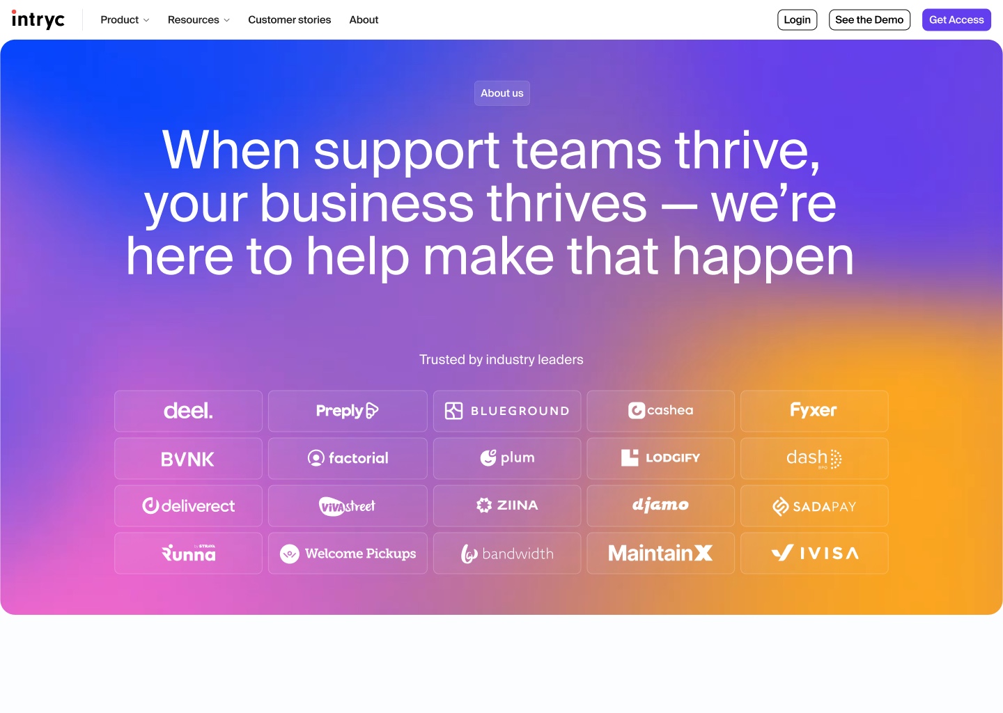
The identity ran on a vibrant purple to pink to yellow gradient that dominated every page it touched. My founder’s word for it was “not premium”, and he was right about the effect if not the cause: the product was reduced to a small screenshot underneath it. A year spent forging new customer relationships needed a site that reads as serious infrastructure, not as a launch announcement.
My role
I was the sole designer and developer taking on this rebuild, working with our CEO and CPO to align on the company’s mission and product capabilities. I was able to take full control over the brand direction, art direction and the design of every page from the Figma file to the production code the site runs on today. Because nothing was handed off, every decision was mine to argue and mine to build: strategy and implementation in the same breath.
Positioning
Intryc is an AI-powered QA and training platform that scores 100% of customer conversations, human and AI alike, and turns what it finds into coaching that measurably improves customer experience.
Key decisions
I worked closely with our CEO and CPO to understand what Intryc wants to communicate through this website: the sharper position the company had moved to, the AI products that had shipped without ever being announced, and the credibility a pre Series A company needs against much larger competitors. That understanding served as the foundation that everything else was built on. Six of the decisions it led to are below.
Because the redesign required a full rebuild, I moved the site off Webflow and into code for full control of layout and animation.
Webflow is strong on content management but weak exactly where this site had to be strong: precise animation and fine layout control. Because this was a 0 → 1 rebuild with no assets to migrate, I pitched rebuilding it from scratch instead, designing in Figma and implementing in code with AI developer tools. As the only designer and the only developer, the handoff cost that normally makes this trade-off expensive did not exist.



The homepage opens on the problem rather than the product to target our customers who tend to be more wary of adapting new technology.
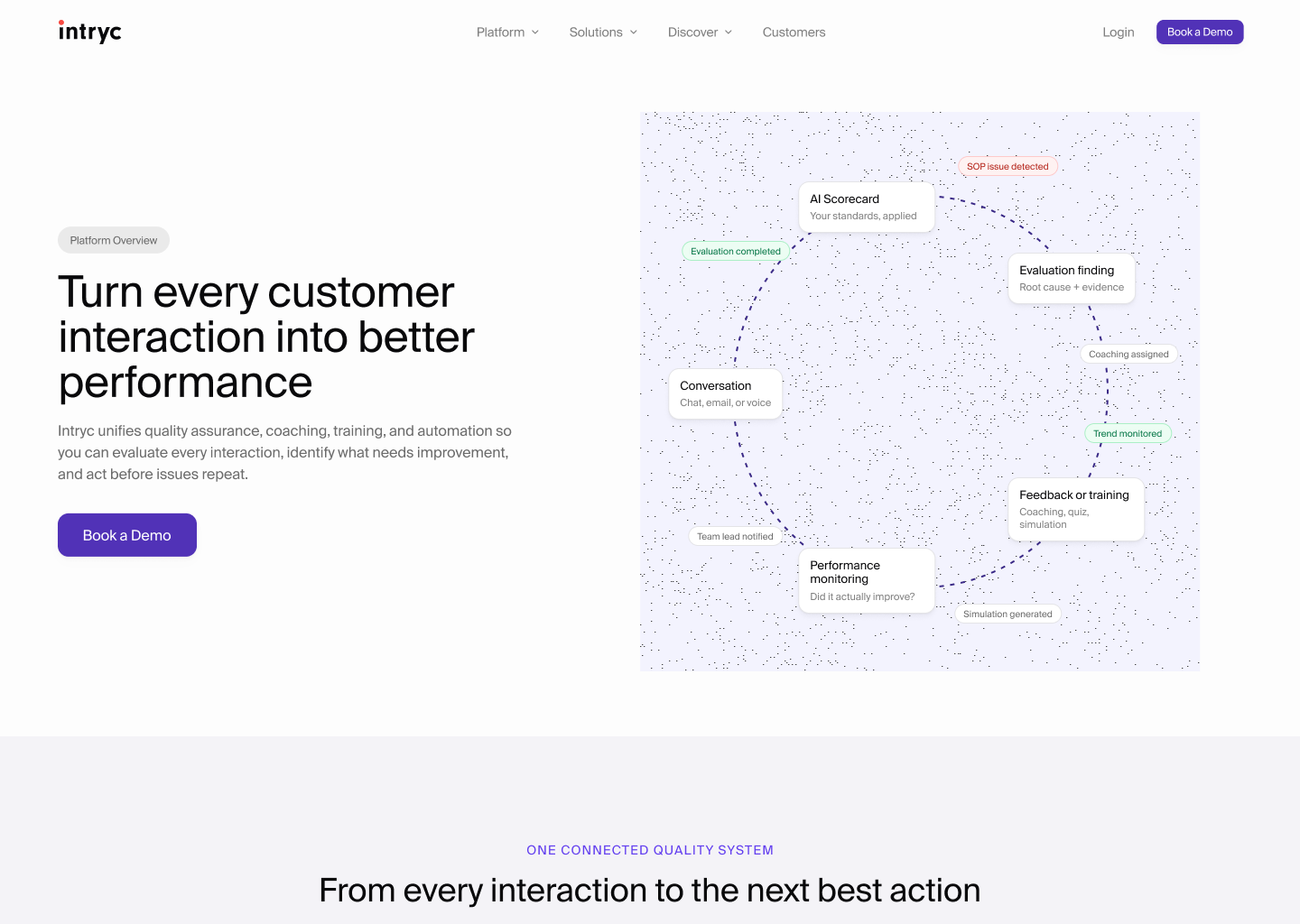
Intryc sells to QA leads and CX managers, who adopt new technology later and more warily than the founders most SaaS sites are written for. The first thing on the page is an interactive visual: scattered tickets, spreadsheets, and Slack threads representing the messy workflow they are used to seeing. On scroll they dissolve into a single, organized workflow that intryc provides. The argument lands before a feature has been named, and it is their own working day being described back to them.
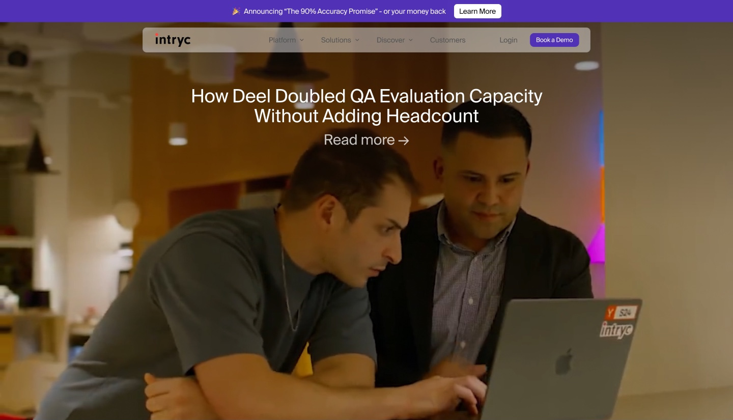
The homepage leads with customer testimonials, establishing trust before it gets to product specifics.
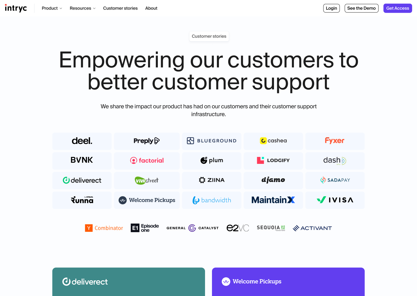
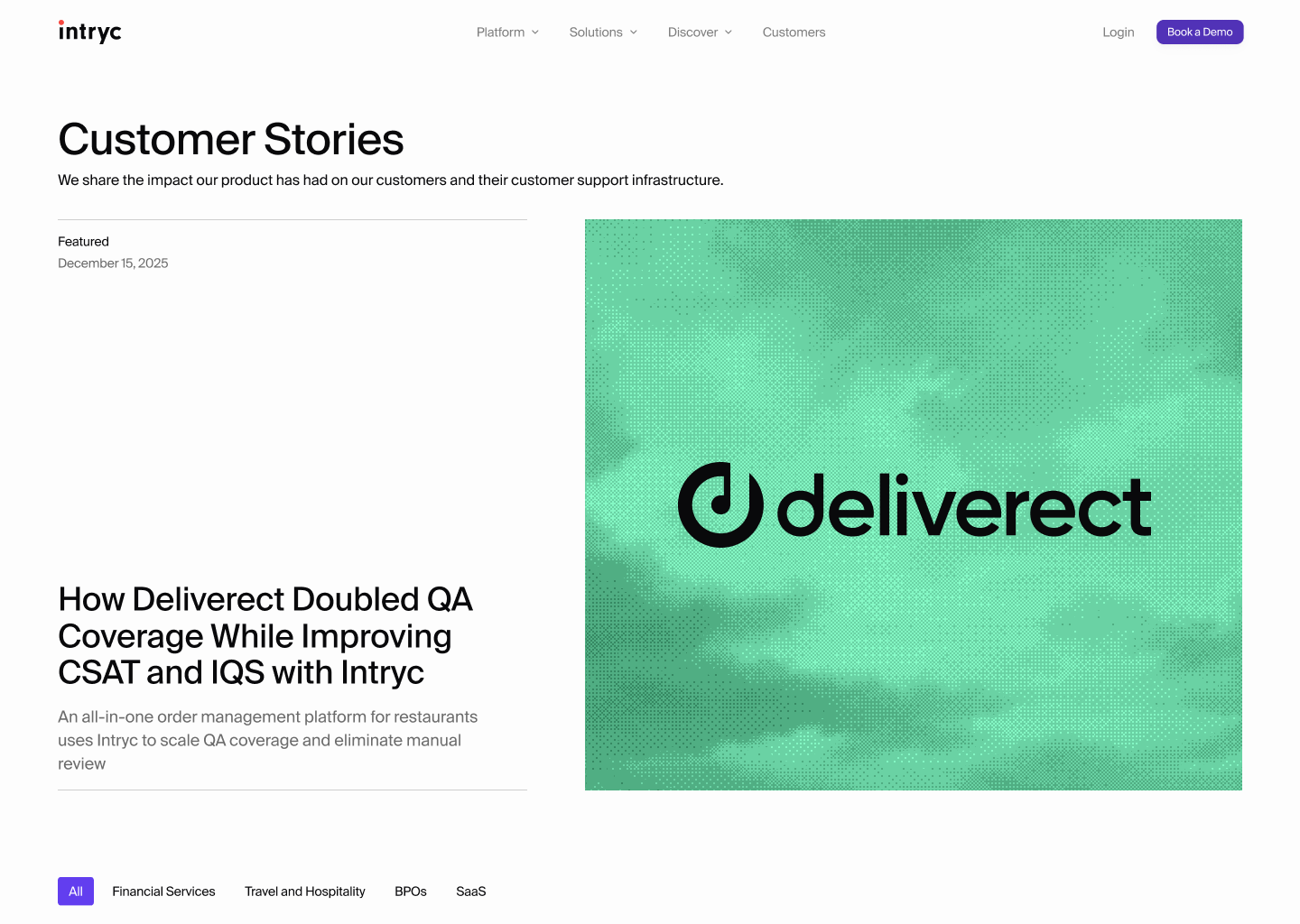
Intryc is still an actively growing startup and often have to pitch against major players such as Zendesk, MaestroQA and Solidroad. While Intryc has strong products and unique AI-powered offerings, it was important to identify that credibility is the constraint at this stage, rather than clarity. A named customer story runs on the homepage with a real outcome in the headline, a dedicated testimonials page collects the rest, and a wall of G2 reviews sits behind it.
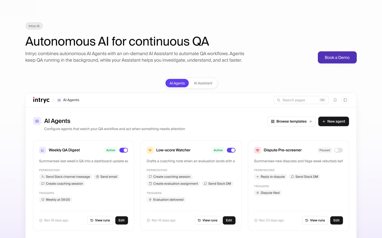
To emphasise our key differentiator, Intryc AI, the two AI products got a section of their own rather than a row in a feature table.
The differentiator is AI that runs in the background instead of asking for a click at every step. Plenty of tools in this category are automated in the sense that a human still drives every step. Intryc’s bet is on agents that work continuously and act on their own, with the human in the loop rather than in the driving seat. The section separates the two offerings explicitly, AI Agents and the AI Assistant, in a side-by-side comparison, then shows a workflow in which agent, assistant and human each take part of the same task: resolving a refund explanation request.
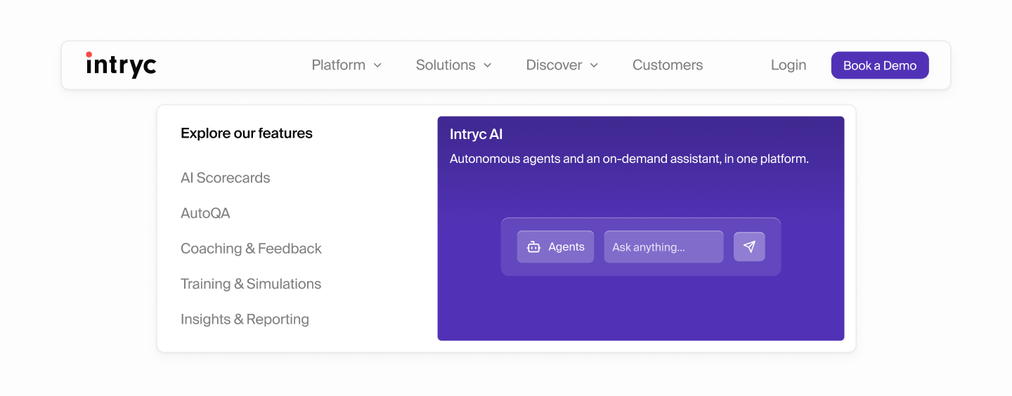
AutoQA, scorecards, coaching and insights kept their familiar names, so the site speaks the language customers already use.
Those are the words customers use for their own jobs. Cutting the familiar terms would have made the site harder to search and harder to recognise. Giving each one its own page would have rebuilt the clutter the redesign existed to remove. Instead each feature is a section of one long platform page, with the navbar linking directly to each. A visitor who came only for Training and Simulations lands on it, and still passes everything else on the way through.
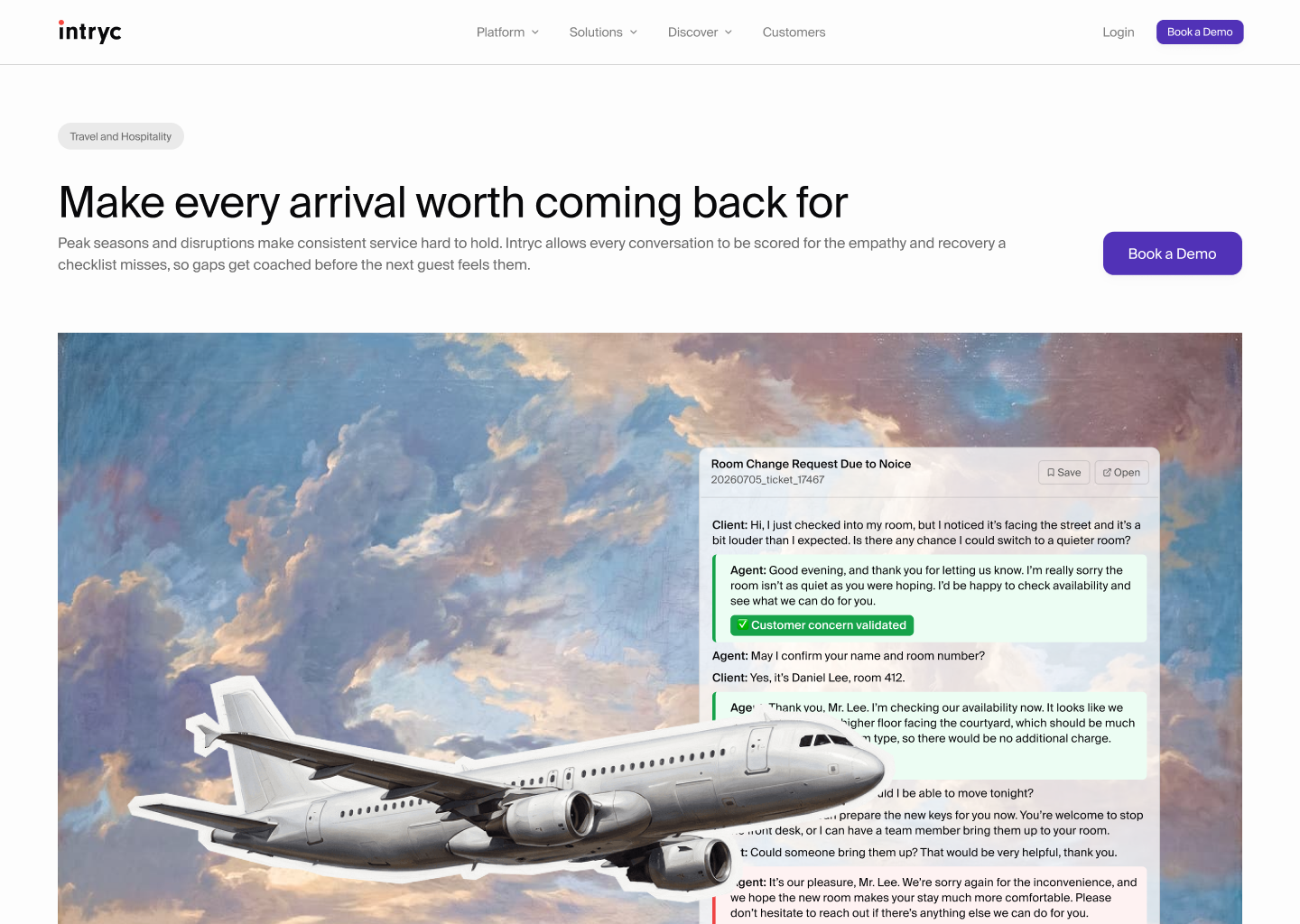
The solution page illustrations tell the story of how Intryc works inside each vertical.
Quality assurance for customer support is still a largely manual industry, and buyers cannot picture an automated version of their own process from a description. The product pages have one job, showing the interface, so they keep it free-standing on flat colour blocks with nothing competing with it. The solution pages do the opposite job: one per vertical, financial services, travel and hospitality, BPOs, SaaS and telecommunications, each asking what Intryc means for that industry specifically. Each gets a painted cloud ground, a collaged object belonging to the vertical, and a real product panel sitting on top, so the storytelling never floats free of the tool. The images are generated with Nano Banana and composed by hand, which makes the assets themselves an instance of the argument the product makes: AI doing the work, a human deciding what it means.
The colour note
Intryc Purple
#623EEF
The old identity ran a purple to pink to yellow gradient, and purple was the part anyone could recall unprompted. The brief was to modernise, not to rebrand, so the recognisable part stayed and everything around it went. One colour, used sparingly, with the product screens carrying the rest.
Purple
#623EEF
Indigo
#3A2986
Purple 300
#827AFF
Ink
#09090B
Canvas
#FDFDFD
The dark surfaces are the tell that this was a system and not a swatch. They are not neutral black: the deep page canvas, the raised surface and the card all carry the same indigo cast as the brand’s dark purple, so a dark section resolves into the footer instead of seaming against it. Blue, pink and yellow survive from the old gradient, but only as pale background tints, and only where a section genuinely needed to be told apart from the one above it.
Before and after
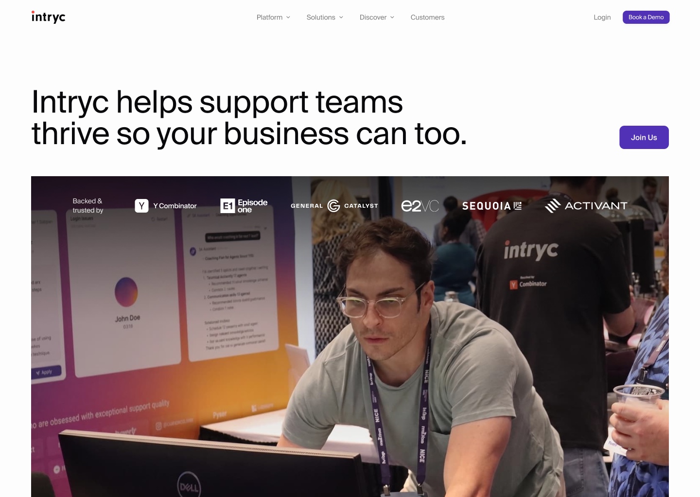
Three pages where the change is easiest to read. In each case the edit was the same: remove the thing doing the talking, and let the product speak in its place.

Outcome
The site launched in 2026 and there are no numbers yet. Traffic, demo requests and sales-cycle effects all need a quarter behind them before they mean anything, and a figure quoted this early would be worth less than saying so.
What exists instead is the handover. Because the site is code rather than a page builder, it is editable by anyone on the team with the AI tooling they already use, so I am writing the internal document that explains how to maintain and extend it. Alongside it I am building an internal image generation tool that produces the oil-painting collage style on demand, so the art direction survives me and can be used for future pages and social posts without a designer in the loop.
What I would do differently: instrument the old site before replacing it. The case for the redesign was strong and, I think, correct, but it rested on a positioning change and a founder’s read, and neither is a baseline. Nothing about the old site was measured, so there is no honest way to attribute whatever the new one does.
The second thing is subtler. The art direction runs in two registers, free-standing interface on the product pages and painted collage on the solution pages. The split is deliberate and I would make it again, but I resolved it late, and the seam is still visible if you move through the site in the wrong order.

INTRYC WEBSITE REDESIGN
SOLE DESIGNER & DEVELOPER / SUMMER 2026
Turning a year of unannounced AI features into a website that finally says what the product does, from positioning through to production code.
Deliverables
- 17
- Pages
- 2
- Templates
- 153
- Components
- 5
- Original graphics
Check out the live website at intryc.com ↗
Context
What is Intryc?
Intryc is a Y Combinator backed startup ↗ building an AI-powered quality assurance and training software for customer support teams. Instead of a manager reading each ticket against a spreadsheet rubric for hours, the platform scores conversations at full volume, flags what went wrong, and turns the findings into coaching, training simulations and reporting with AI assistance. It sells to QA leads and CX managers at companies like Deel and Deliverect, who uses Intryc to improve daily customer experience operations.
The problem
- 01
A year’s worth of unannounced features
AutoQA, AI agents, an AI assistant and an action centre all shipped after the last website was built, and none of them appeared on it. Prospects were arriving, reading a description of a product that no longer existed, and leaving without knowing what they had just missed.
- 02
Outdated company positioning
The positioning had moved, narrower and sharper: take the repetitive work off people’s shoulders so their time goes to the customer experience itself. The old site sold a breadth of QA functions, one for every role in a support organisation, and read as the inventory it was. The same idea appeared in three places under three names, and the visitor was left to assemble the story.
- 03
Visuals competing for attention
The identity ran on a vibrant purple to pink to yellow gradient that dominated every page it touched. My founder’s word for it was “not premium”, and he was right about the effect if not the cause: the product was reduced to a small screenshot underneath it. A year spent forging new customer relationships needed a site that reads as serious infrastructure, not as a launch announcement.
My role
I was the sole designer and developer taking on this rebuild, working with our CEO and CPO to align on the company’s mission and product capabilities. I was able to take full control over the brand direction, art direction and the design of every page from the Figma file to the production code the site runs on today. Because nothing was handed off, every decision was mine to argue and mine to build: strategy and implementation in the same breath.
Positioning
Intryc is an AI-powered QA and training platform that scores 100% of customer conversations, human and AI alike, and turns what it finds into coaching that measurably improves customer experience.
Key decisions
I worked closely with our CEO and CPO to understand what Intryc wants to communicate through this website: the sharper position the company had moved to, the AI products that had shipped without ever being announced, and the credibility a pre Series A company needs against much larger competitors. That understanding served as the foundation that everything else was built on. Six of the decisions it led to are below.
Because the redesign required a full rebuild, I moved the site off Webflow and into code for full control of layout and animation.
Webflow is strong on content management but weak exactly where this site had to be strong: precise animation and fine layout control. Because this was a 0 → 1 rebuild with no assets to migrate, I pitched rebuilding it from scratch instead, designing in Figma and implementing in code with AI developer tools. As the only designer and the only developer, the handoff cost that normally makes this trade-off expensive did not exist.
The homepage opens on the problem rather than the product to target our customers who tend to be more wary of adapting new technology.
Intryc sells to QA leads and CX managers, who adopt new technology later and more warily than the founders most SaaS sites are written for. The first thing on the page is an interactive visual: scattered tickets, spreadsheets, and Slack threads representing the messy workflow they are used to seeing. On scroll they dissolve into a single, organized workflow that intryc provides. The argument lands before a feature has been named, and it is their own working day being described back to them.
The homepage leads with customer testimonials, establishing trust before it gets to product specifics.
Intryc is still an actively growing startup and often have to pitch against major players such as Zendesk, MaestroQA and Solidroad. While Intryc has strong products and unique AI-powered offerings, it was important to identify that credibility is the constraint at this stage, rather than clarity. A named customer story runs on the homepage with a real outcome in the headline, a dedicated testimonials page collects the rest, and a wall of G2 reviews sits behind it.
To emphasise our key differentiator, Intryc AI, the two AI products got a section of their own rather than a row in a feature table.
The differentiator is AI that runs in the background instead of asking for a click at every step. Plenty of tools in this category are automated in the sense that a human still drives every step. Intryc’s bet is on agents that work continuously and act on their own, with the human in the loop rather than in the driving seat. The section separates the two offerings explicitly, AI Agents and the AI Assistant, in a side-by-side comparison, then shows a workflow in which agent, assistant and human each take part of the same task: resolving a refund explanation request.
AutoQA, scorecards, coaching and insights kept their familiar names, so the site speaks the language customers already use.
Those are the words customers use for their own jobs. Cutting the familiar terms would have made the site harder to search and harder to recognise. Giving each one its own page would have rebuilt the clutter the redesign existed to remove. Instead each feature is a section of one long platform page, with the navbar linking directly to each. A visitor who came only for Training and Simulations lands on it, and still passes everything else on the way through.
The solution page illustrations tell the story of how Intryc works inside each vertical.
Quality assurance for customer support is still a largely manual industry, and buyers cannot picture an automated version of their own process from a description. The product pages have one job, showing the interface, so they keep it free-standing on flat colour blocks with nothing competing with it. The solution pages do the opposite job: one per vertical, financial services, travel and hospitality, BPOs, SaaS and telecommunications, each asking what Intryc means for that industry specifically. Each gets a painted cloud ground, a collaged object belonging to the vertical, and a real product panel sitting on top, so the storytelling never floats free of the tool. The images are generated with Nano Banana and composed by hand, which makes the assets themselves an instance of the argument the product makes: AI doing the work, a human deciding what it means.
The colour note
Intryc Purple
#623EEF
The old identity ran a purple to pink to yellow gradient, and purple was the part anyone could recall unprompted. The brief was to modernise, not to rebrand, so the recognisable part stayed and everything around it went. One colour, used sparingly, with the product screens carrying the rest.
Purple
#623EEF
Indigo
#3A2986
Purple 300
#827AFF
Ink
#09090B
Canvas
#FDFDFD
The dark surfaces are the tell that this was a system and not a swatch. They are not neutral black: the deep page canvas, the raised surface and the card all carry the same indigo cast as the brand’s dark purple, so a dark section resolves into the footer instead of seaming against it. Blue, pink and yellow survive from the old gradient, but only as pale background tints, and only where a section genuinely needed to be told apart from the one above it.
Before and after
Three pages where the change is easiest to read. In each case the edit was the same: remove the thing doing the talking, and let the product speak in its place.
Outcome
The site launched in 2026 and there are no numbers yet. Traffic, demo requests and sales-cycle effects all need a quarter behind them before they mean anything, and a figure quoted this early would be worth less than saying so.
What exists instead is the handover. Because the site is code rather than a page builder, it is editable by anyone on the team with the AI tooling they already use, so I am writing the internal document that explains how to maintain and extend it. Alongside it I am building an internal image generation tool that produces the oil-painting collage style on demand, so the art direction survives me and can be used for future pages and social posts without a designer in the loop.
What I would do differently: instrument the old site before replacing it. The case for the redesign was strong and, I think, correct, but it rested on a positioning change and a founder’s read, and neither is a baseline. Nothing about the old site was measured, so there is no honest way to attribute whatever the new one does.
The second thing is subtler. The art direction runs in two registers, free-standing interface on the product pages and painted collage on the solution pages. The split is deliberate and I would make it again, but I resolved it late, and the seam is still visible if you move through the site in the wrong order.